
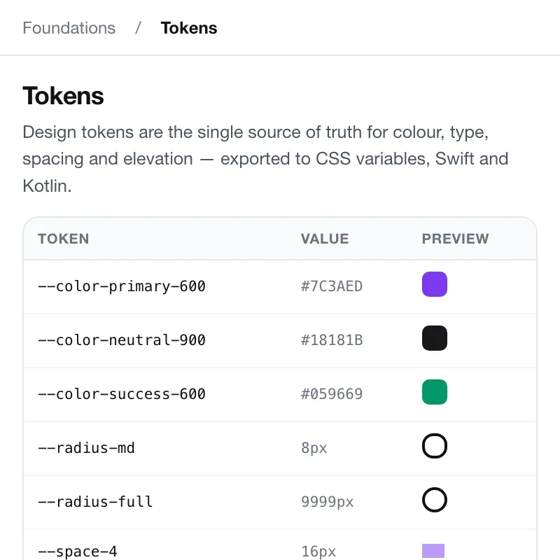
Token overview
Colour, type, spacing and radius as named tokens, with where each one is used. Change a token here and the whole library re-renders, so the docs never drift from the code.
- Tokens
- about 240
- Source
- one JSON, code and Figma
Design system and living component library for a Series-B fintech.
Web · 2023
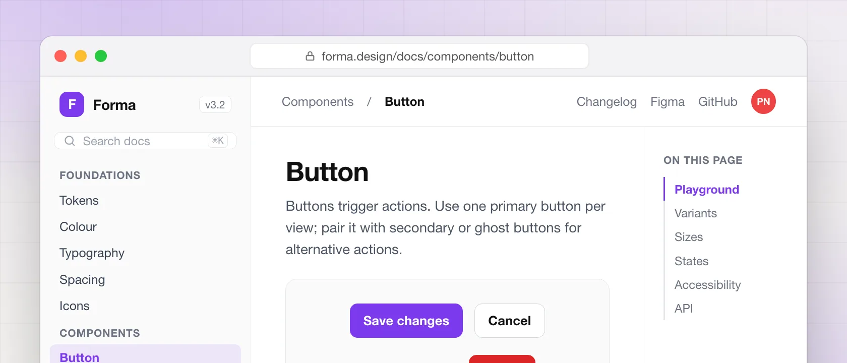
A Series-B fintech with three product teams and three different button styles. We audited every screen, designed the tokens and components once, and shipped a documented library with a live playground — now the source of truth for 200+ components.
Every screen people use: what it does, the decision behind it, and the details.
Colour, type, spacing and radius as named tokens, with where each one is used. Change a token here and the whole library re-renders, so the docs never drift from the code.
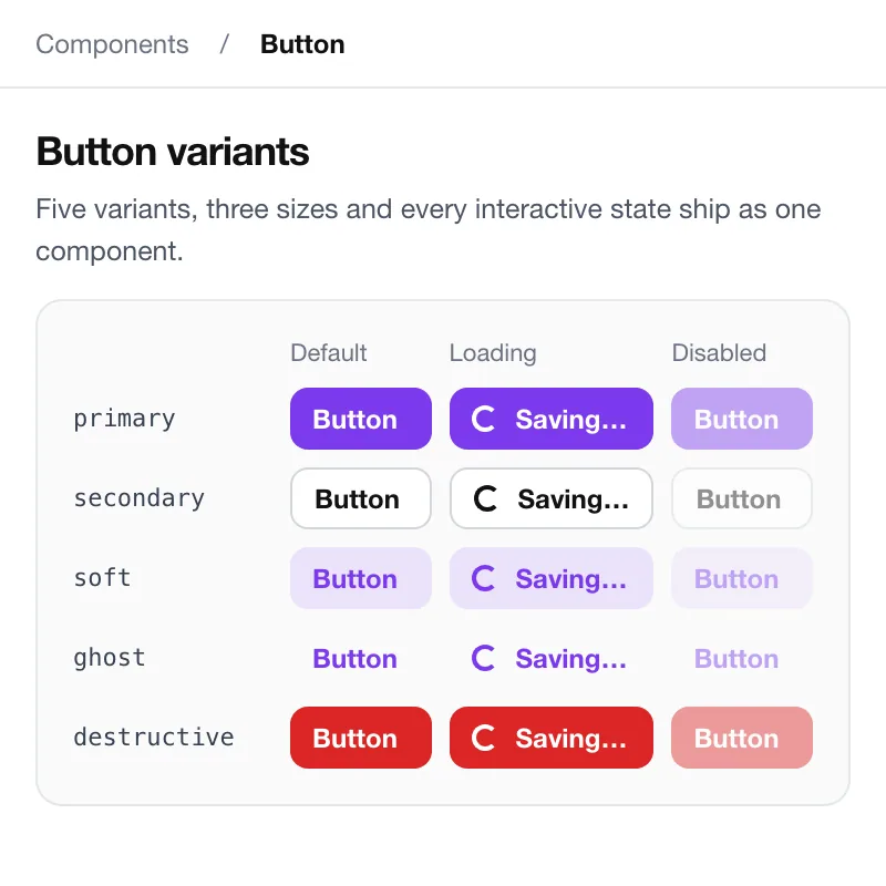
Every button in every state, generated from the component rather than drawn. Hover, focus, loading and disabled are real, so accessibility is checked on the page, not in a review.
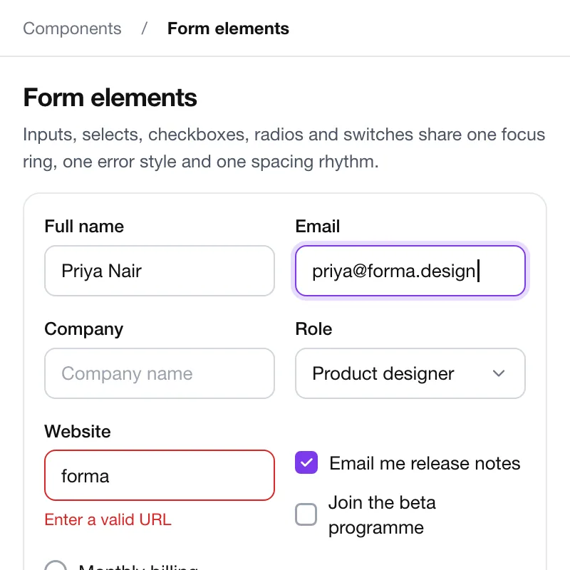
Inputs, selects, checkboxes and validation, with the error copy the product actually uses. The examples run real validation, so the behaviour on the docs page is the behaviour in the app.
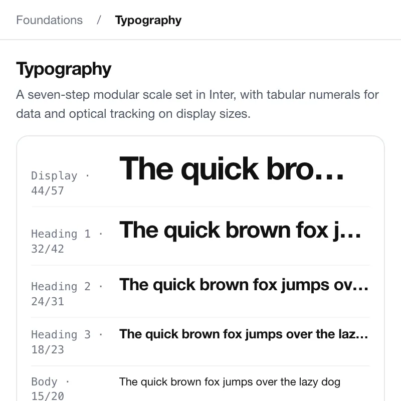
The type scale with its line heights and where each step is used, from the data table to the marketing headline. Two families, five steps, and rules for when to stop.
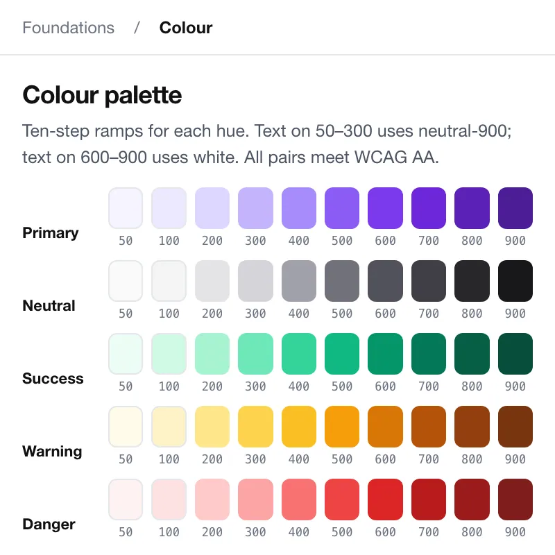
Semantic colours over the raw palette: text, surface, border, status. Contrast ratios are computed live, so a change that fails AA is caught before it ships.
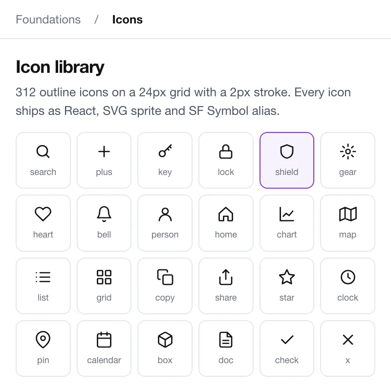
Searchable, copyable icons on one grid, at the sizes they're drawn for. Every icon ships as one component with an accessible name, never as an image.
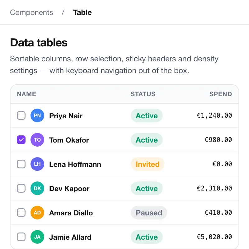
The component the fintech lives in: dense rows, sticky headers, sorting, selection and inline editing. Tested at ten thousand rows, because that is the real dataset.
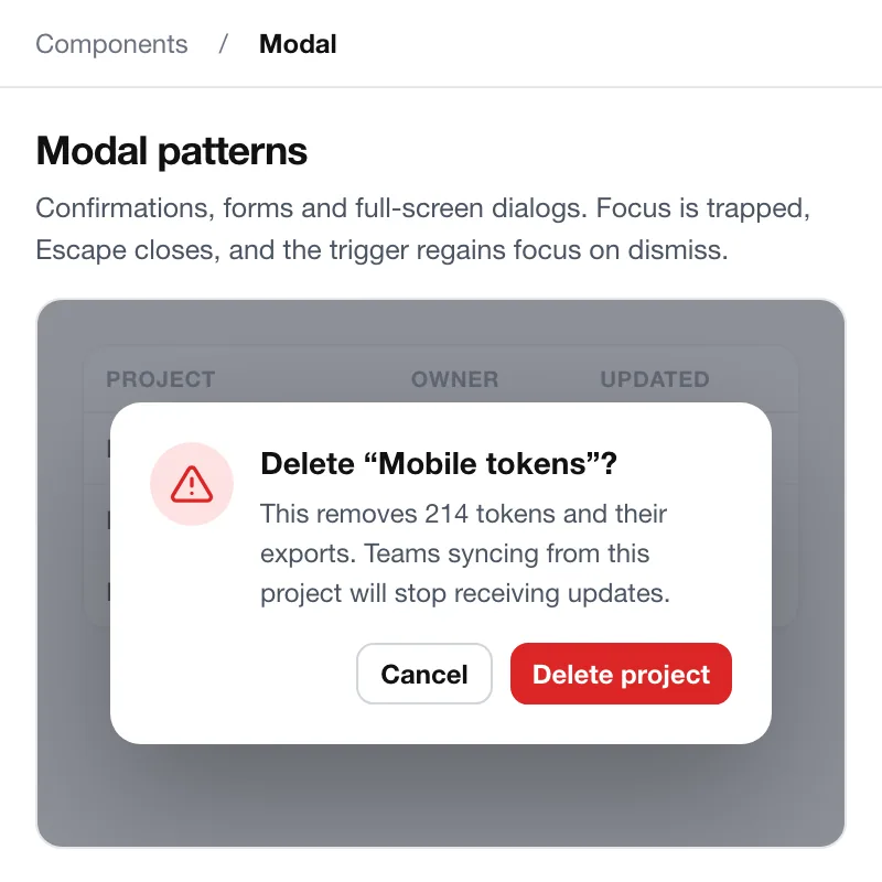
Confirmation, form and full-screen dialogs, with focus, escape and scroll handled once. The rules say which to use, so the product doesn't grow a sixth kind.
“From discovery to launch in 14 weeks. Structured, transparent, and genuinely enjoyable to work with. We're already scoping the next project.”
Priya Nair
Product Lead, Forma Design
A written take on scope, timeline and budget, from the person who'd lead your product.
or write to hello@soooftware.com